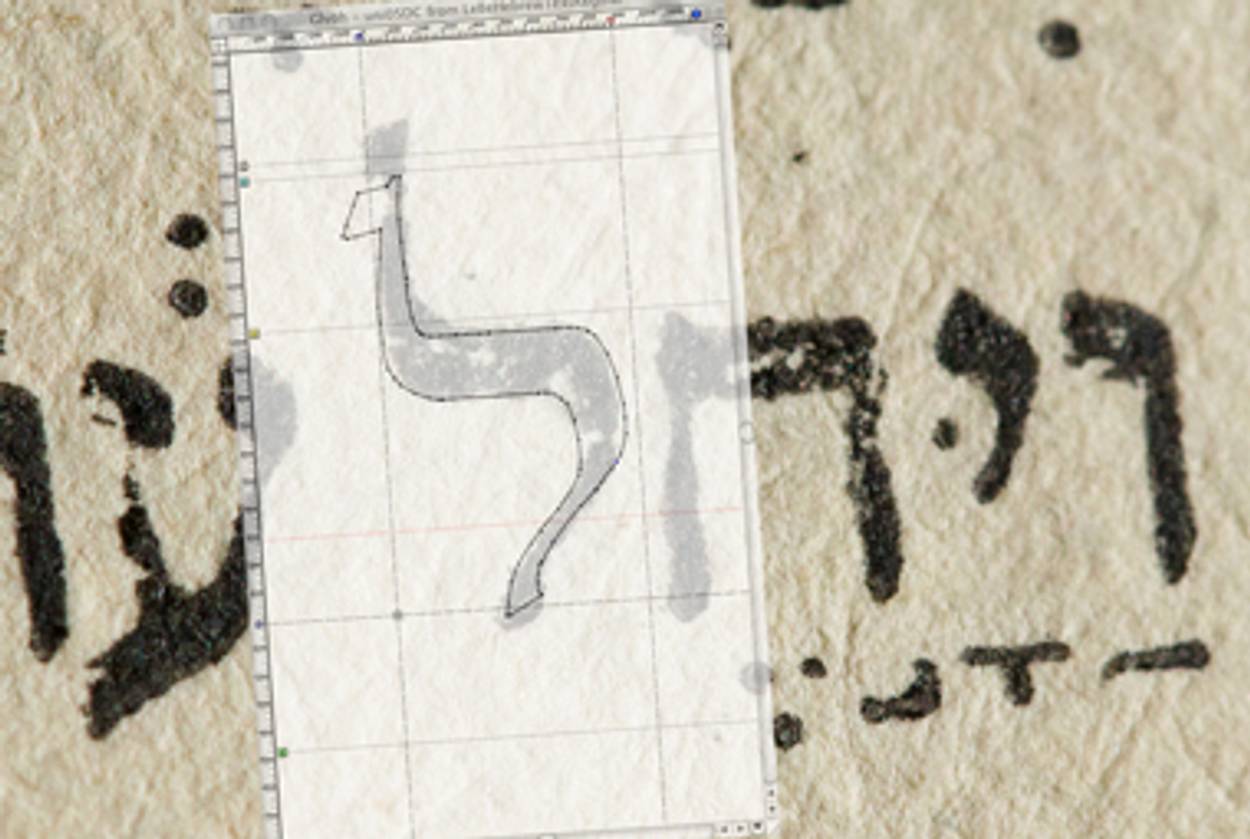
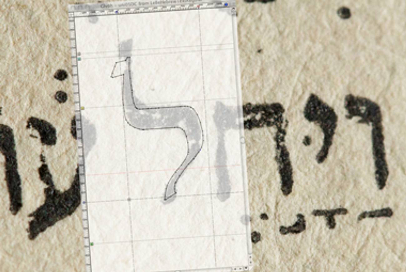
When type designer Scott-Martin Kosofsky set out to create a new digital typeface of Hebrew characters, he and type legend Matthew Carter reached far back into history. The result is Le Bé, and it’s based on one of the first Hebrew movable types, a famously beautiful typeface—Kosofsky calls it exuberant and confident—that first appeared in 1569 in the Plantin Polyglot Bible. Its newly digitized version, still in development, will debut in The Selected Poems of Yehuda Halevi, an original e-book from Nextbook Press with translations and commentary by Hillel Halkin. Tablet Magazine visited Kosofsky’s workshop in Lexington, Mass., to see how he adapted a 16th-century calligraphic type for the digital age. In this audio slideshow, Kosofsky shows off his work and explains what drew him to the font, the particular challenges the Hebrew alphabet poses to typographers, and why he sees Le Bé as Hebrew’s equivalent to the elegant and ubiquitous Garamond.
The Selected Poems of Yehuda Halevi is available from Nextbook Press here.

