
This Typeface Combines Hebrew and Arabic Equally
Israeli typographer Liron Lavi Turkenich has married two ancient languages in script, and it’s legible
June 09, 2017
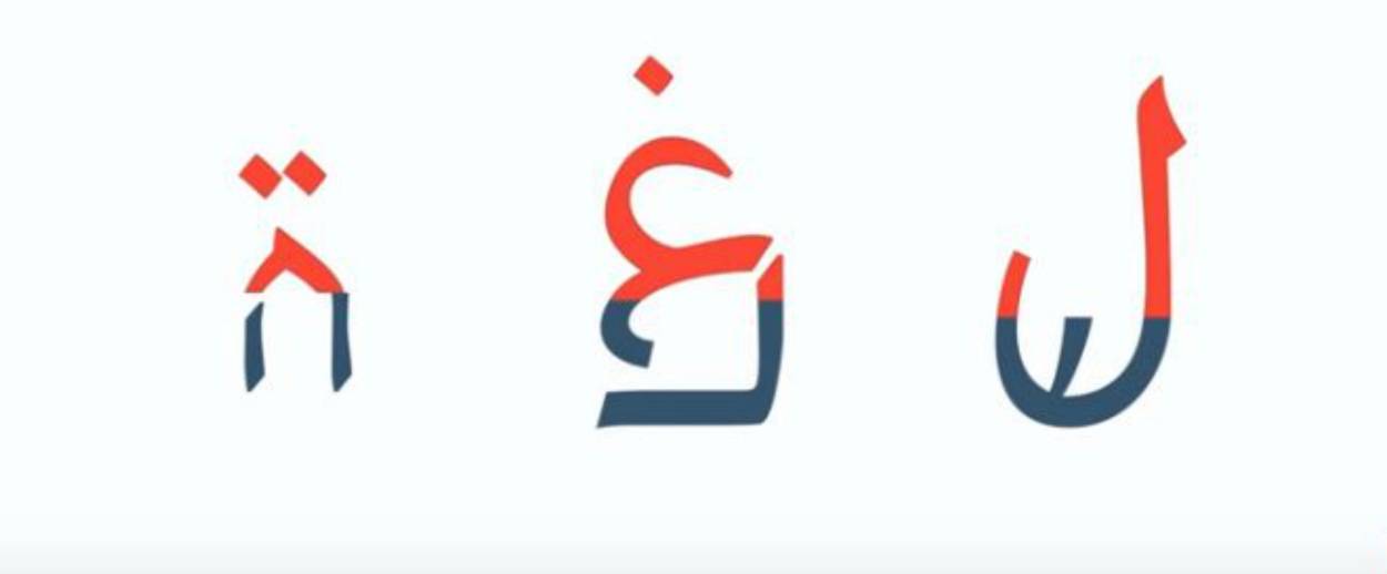

A lot of public signage in Israel has both Hebrew and Arabic, but Israeli typographer Liron Lavi Turkenich has decided to explore the relationship between these two languages even further. Her typeface, which uses equal parts of both languages, is based on the principle that it is still possible, for the most part, to read and understand written sentences when the top or bottom half of each word is covered. With this in mind, Turkenich merged the bottom half of Hebrew with the top half of Arabic, weaving together a typeface that could be understood by speakers of both languages. “It started as an experimental project that was supposed to help me and help others not ignore the other scripts that are around us,” she said.
Her typeface is an extremely elegant marriage of the two languages, and looks as if it could be a cousin of Aramaic. It is also, perhaps, one of the only new written languages that can be immediately understood by nearly half a billion people.
Because typefaces for use in public must be dependable and direct ways of communicating information, the entire field of designing them is, by necessity, one of the most overlooked art forms. Art Nouveau and Deco masterpieces hide in plain sight in train stations and on street signs around the world, and Turkenich’s visually stunning hybrid language manages to fulfill this basic constraint. Turkenich had to tease out the visual and stylistic similarities in both languages in order to make each fully legible. It was a tremendous undertaking, especially because both of the languages can appear different based on where characters appear in a particular word. “The hardest part for me was trying to keep the essence of each script, to stay true to its tradition and not erase it,” she said.
The two languages live in such close proximity and their relationship is so charged and share so many etymological roots that Turkenich’s typeface can therefore also be understood as a work of public, conceptual art. It is democratic in its attempt to make the reading experience natural both for Hebrew and Arabic readers. It doesn’t try to blend the two into a single, new language—alien to both sides—but allows each language to exist and serve the needs of those who read it alongside—and part of—the other. This, after all, is part of the reason she decided to start this project: “I noticed I was ignoring the Arabic on the signage,” she said. “I wanted to see how these two scripts can be used together to get the same attention.”
And even though her work does not have any official role, Turkenich may have come up with an effective and diplomatic one-script solution.
Related: Signs of the Times
Alexander Aciman is a writer living in New York. His work has appeared in, among other publications, The New York Times, Vox, The Wall Street Journal, and The New Republic.


