
The Jewish Type of Type
When tribute becomes kitsch
June 28, 2010

(Sholom, Hebrewish, and Circumcision Fonts.)
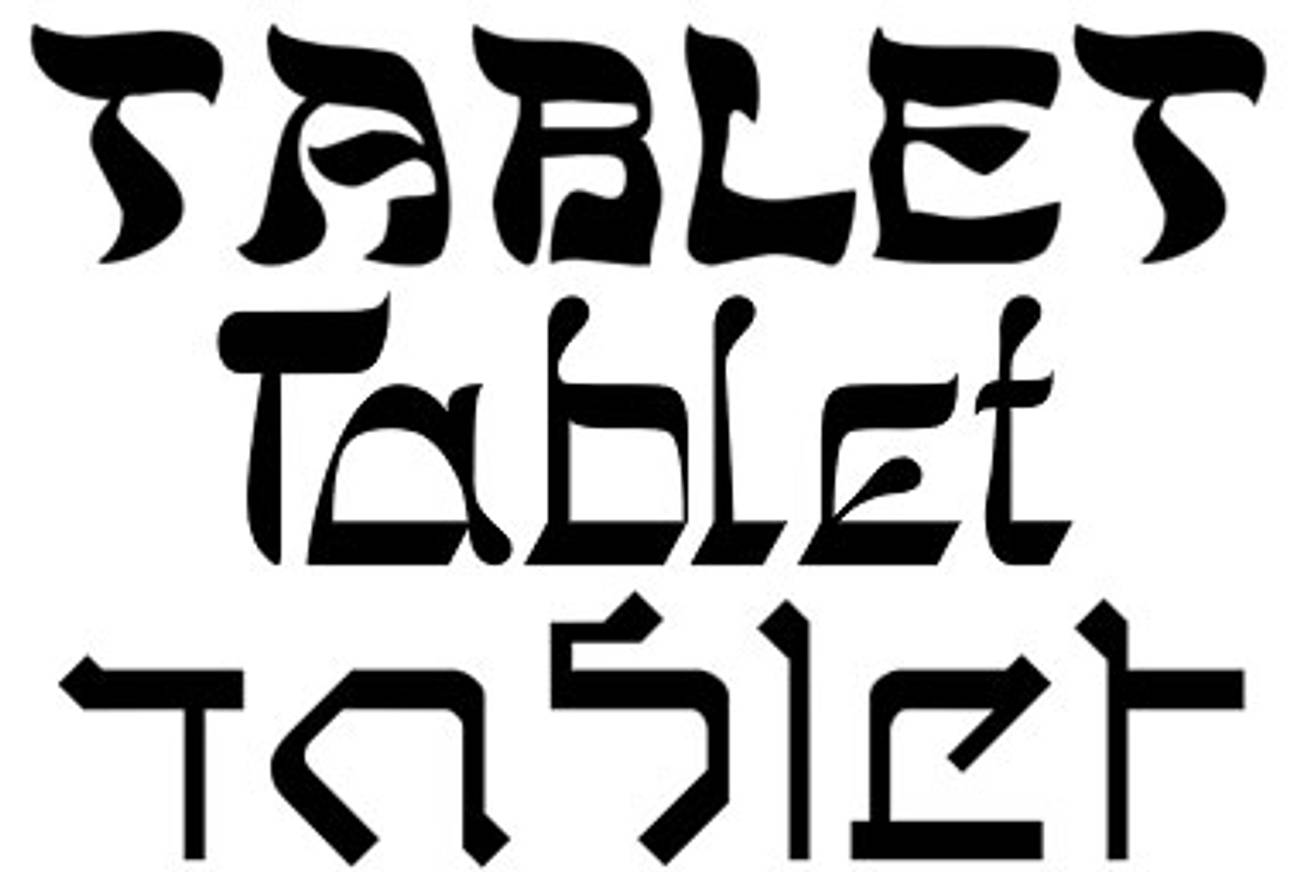
Good thing there’s design writers like Jessica Helfand, of Design Observer, to remind us of typography’s chronic suffering of false Hebraics. More specifically: The vague ghetto-izing of Latin letters to Hebrew handles; the pouring of shmaltz onto font. The names themselves give it away: Hebrewish, Faux Hebrew, Bagel, Jerusalem, Sholom, Talmud, and—the most painful moniker of all—Circumcision.
While Jews can take a certain pride in the kitsch value of this treatment (after all, didn’t the Jews invent kitsch?), Helfand points out that these letter treatments brush aside aspirations for more serious type designers. She also challenges us to consider: “What’s the difference between a celebrity making an unforgivable racist remark and a typographer making a font that clumsily perpetuates a cultural stereotype?” Perhaps we should ponder the relevance of a “Jewish” type over a He’Brew.
Why Is This Font Different From All Other Fonts? (Design Observer)
Len Small is Tablet Magazine’s art director.


